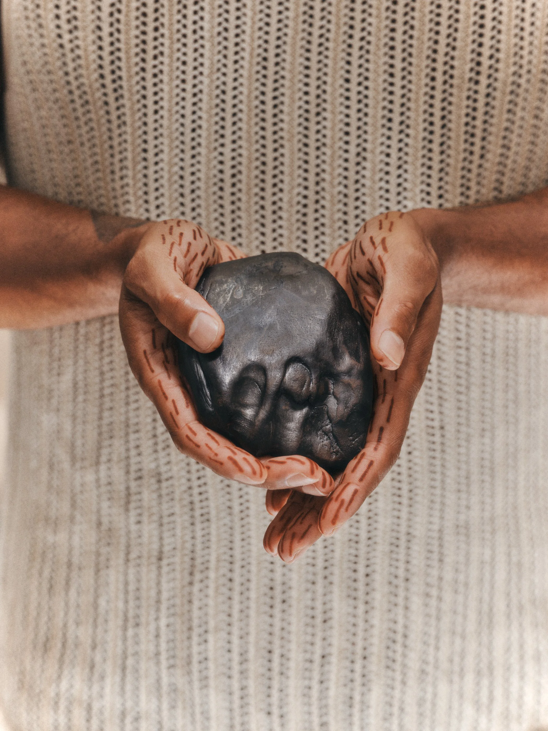
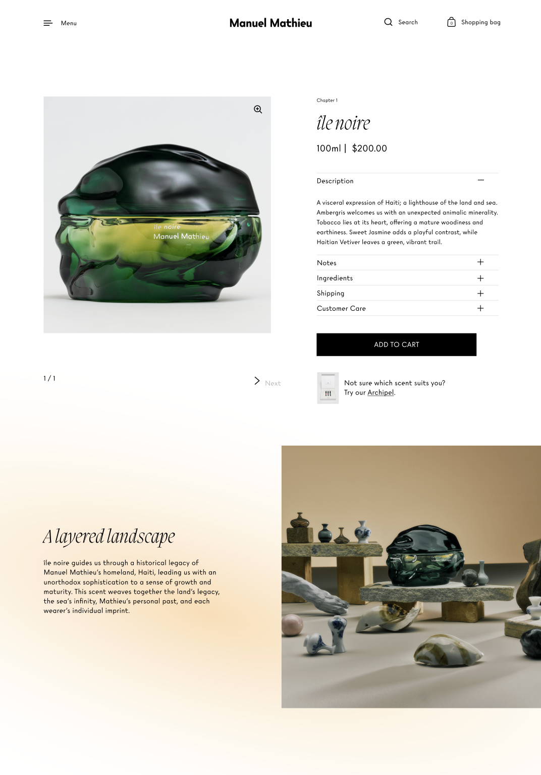
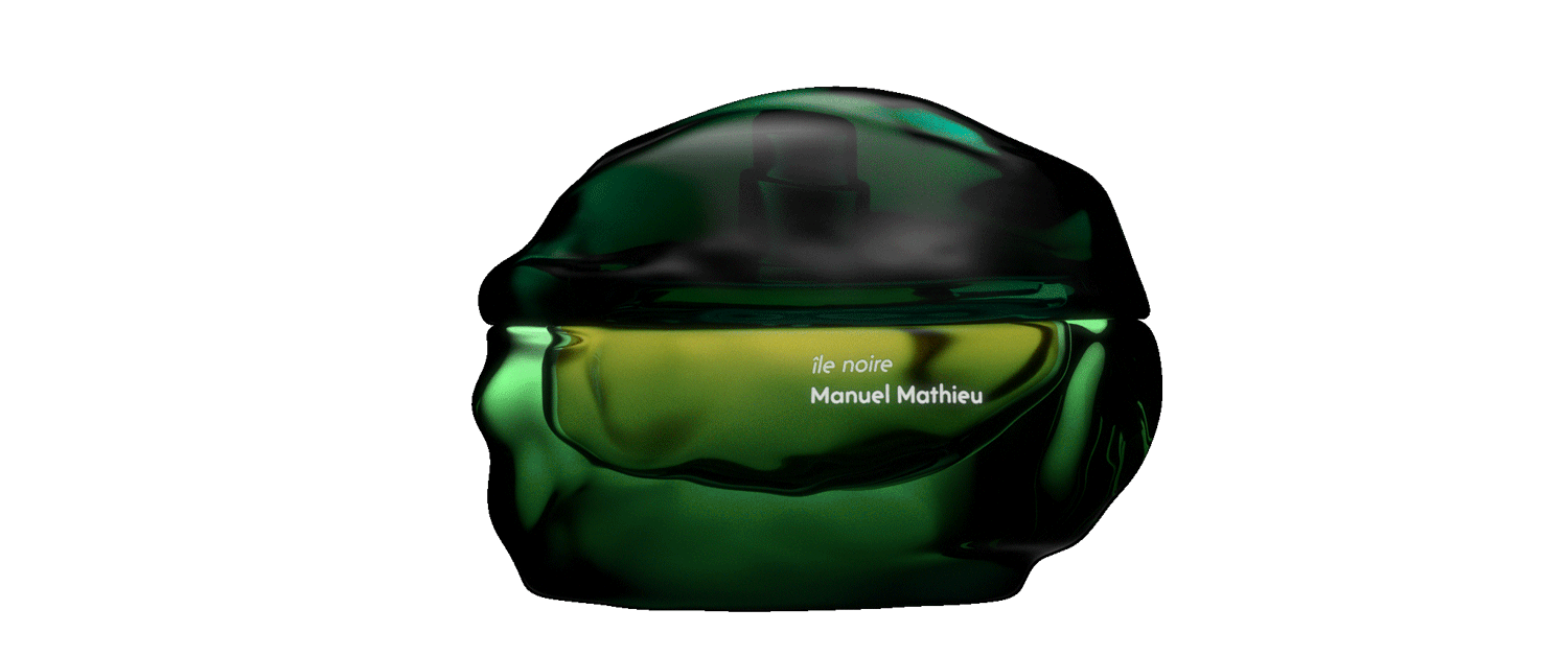
Manuel Mathieu Parfums
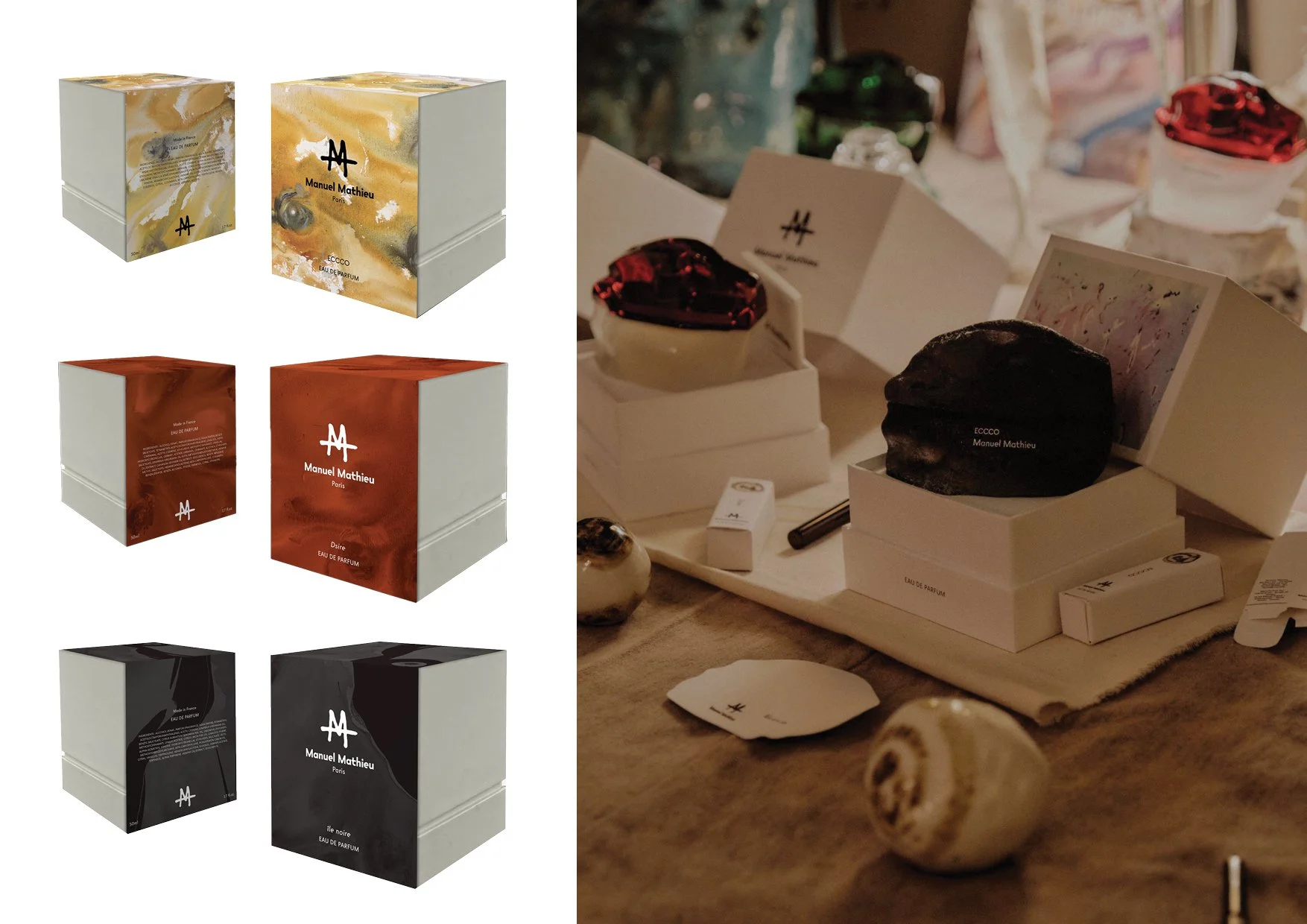
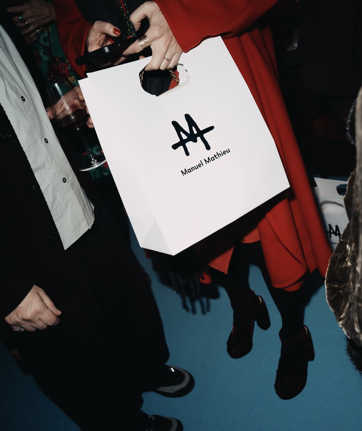
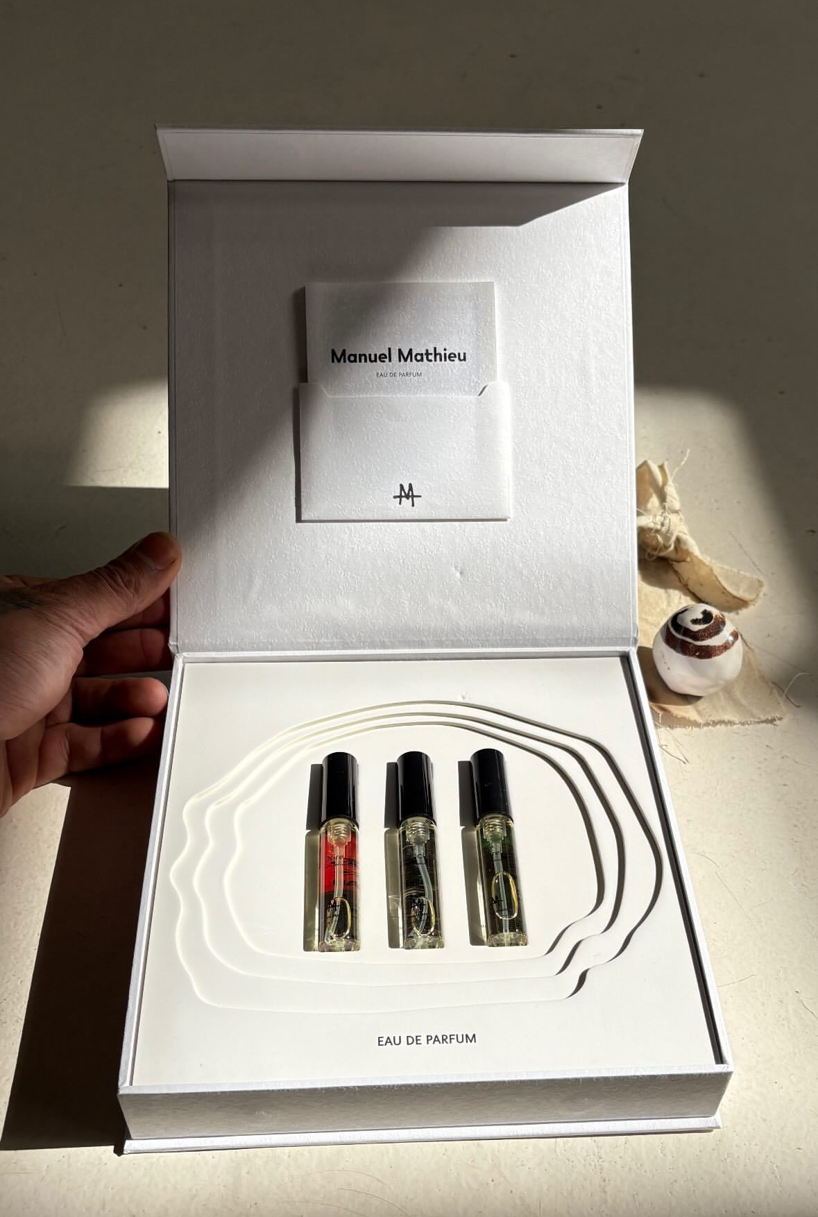
I designed the branding, typography system, colour architecture and art direction principles to ensure long-term cohesion and scalability. This translated seamlessly into the website, where I crafted the UX, UI, layout hierarchy, and visual storytelling to create a refined, intuitive experience aligned with the brand’s positioning. I also designed the high level packaging. Every touchpoint was developed as part of a unified, considered brand world rather than standalone assets.
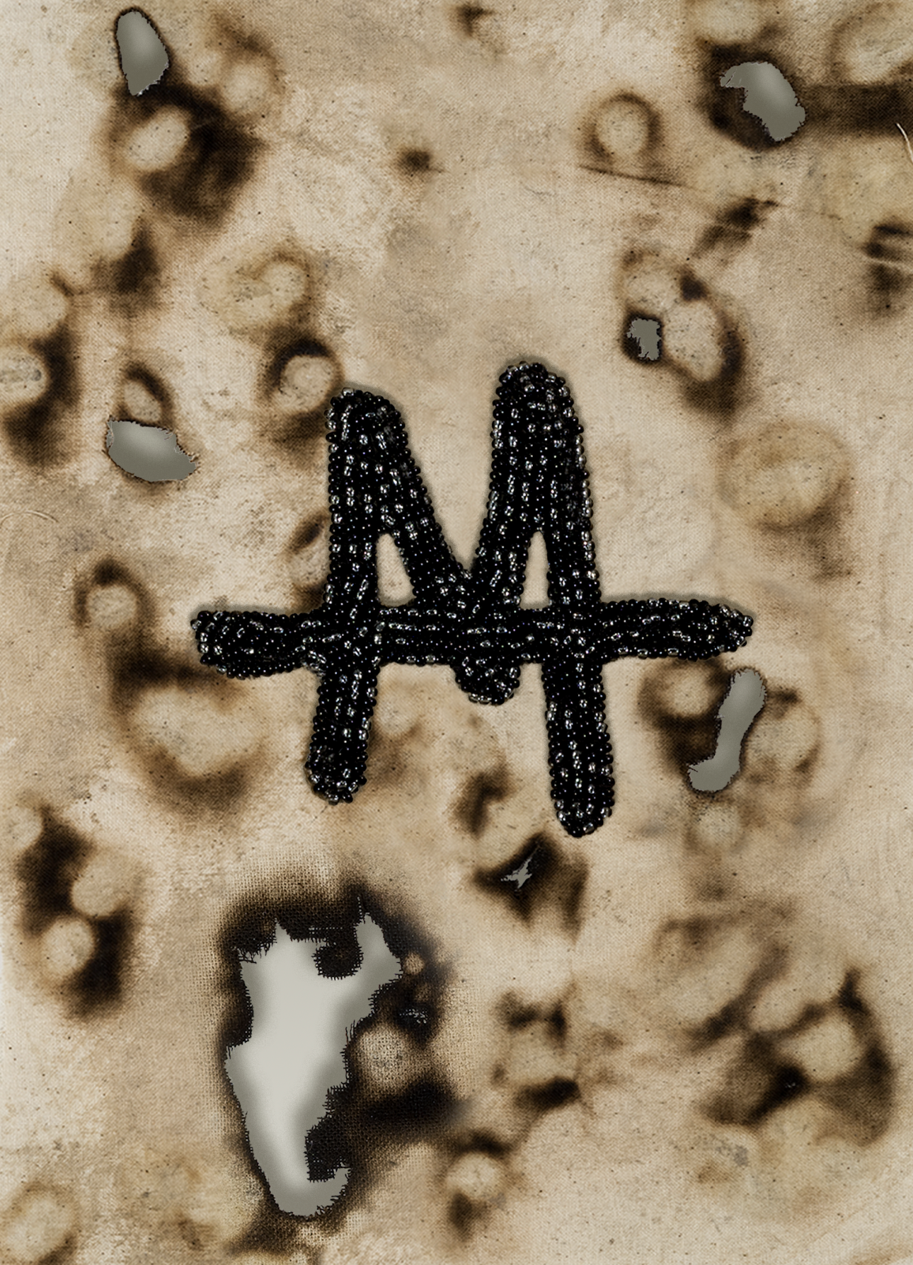
Manuel Mathieu Parfums LogoDrawing on Manuel's background as an artist, the typographic direction is rooted the art world and in history. I found one influenced both by geometric Modernist monoline typefaces and by examples of Dutch and German sans-serif typography from the 1930s.

-
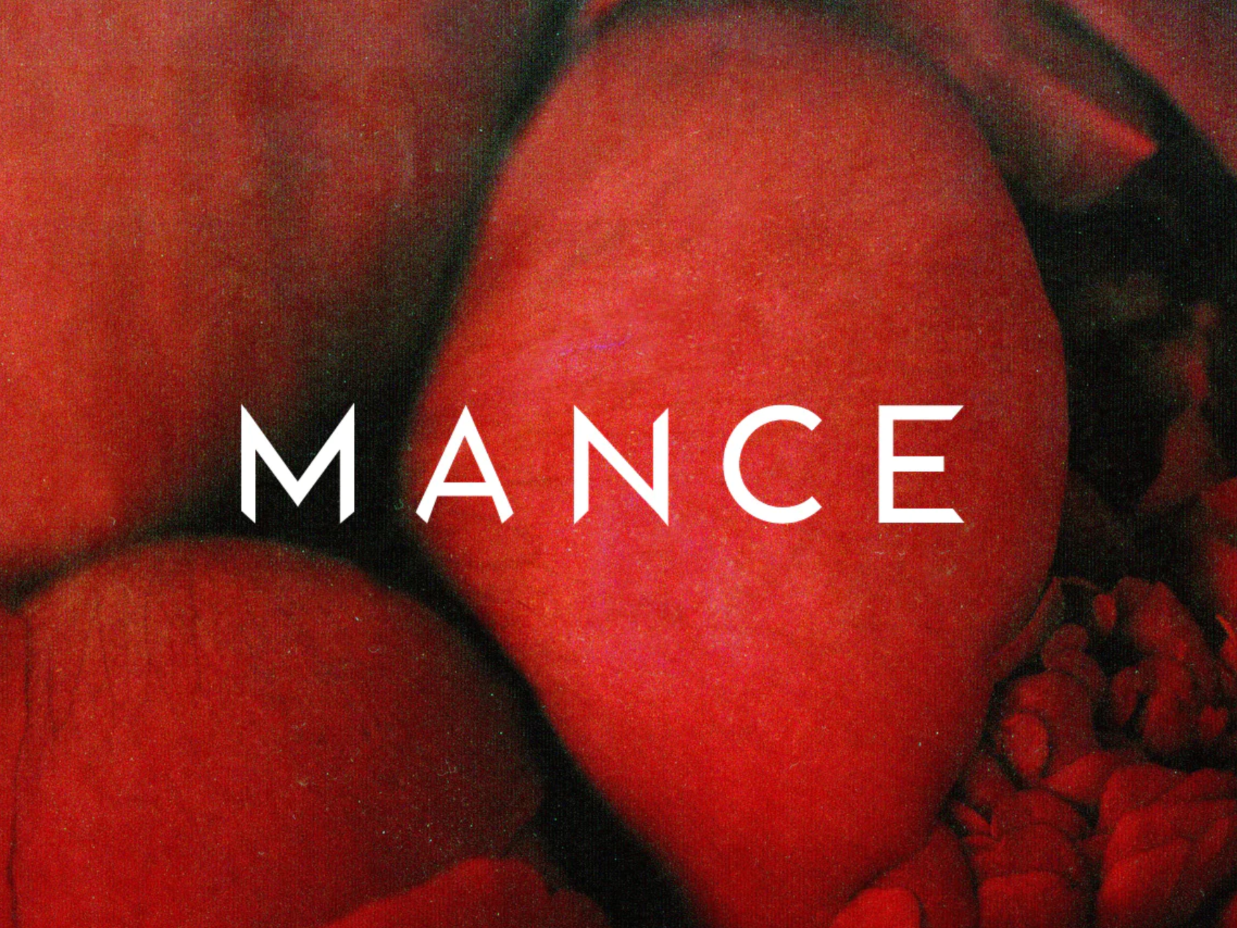
![Close-up of red apples with the word 'MANCE' overlaid in white text.]()
Mance Branding
-
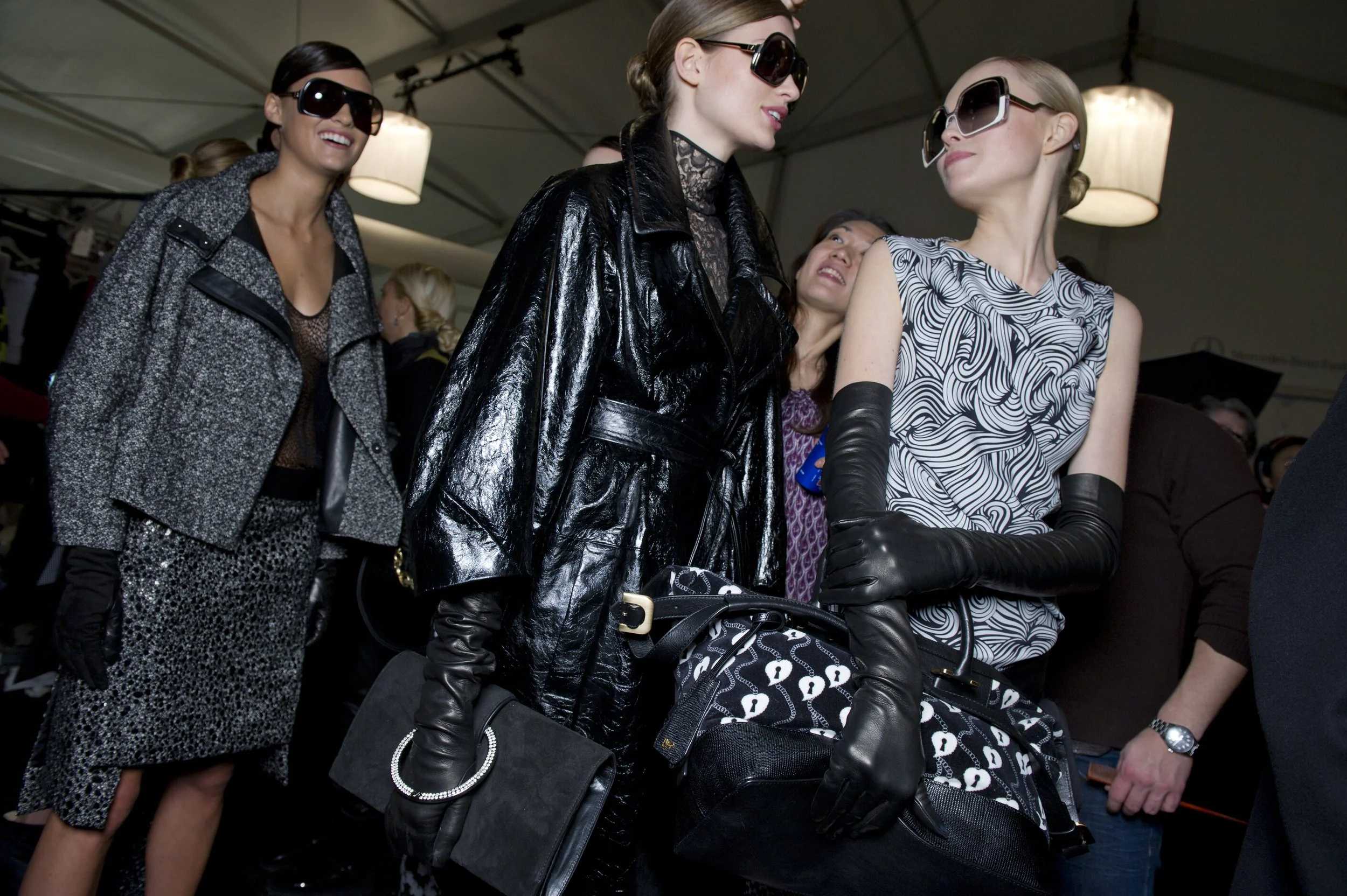
![Fashionably dressed women wearing sunglasses and gloves at a fashion event or gathering.]()
Harrods
-
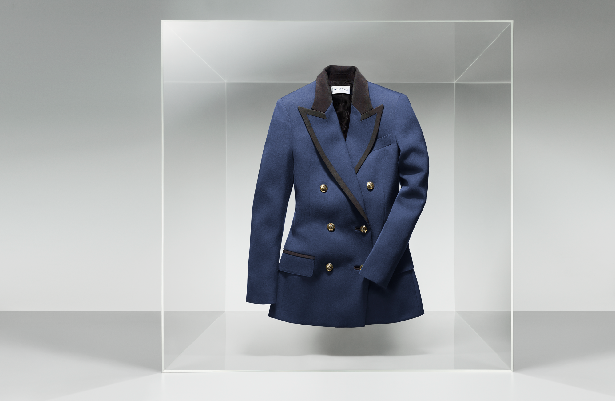
![A stylish blue blazer with black lapels and gold buttons, displayed in a clear glass case against a white background.]()
NET-A-PORTER
-
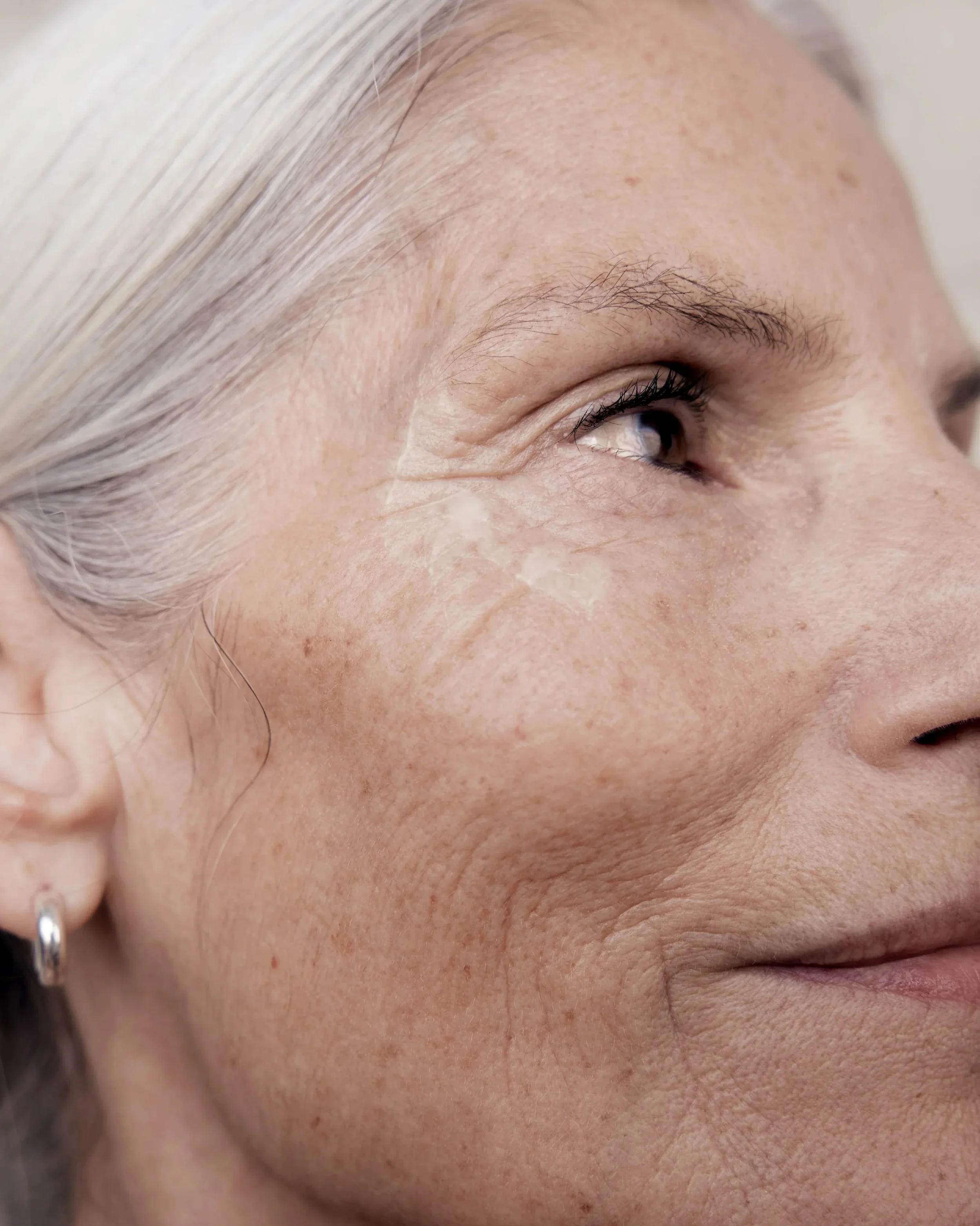
![Close-up of the right side of an elderly woman's face showing skin texture and wrinkles.]()
Naturisimo